Rebuilding a Brand to Standout and Differentiate
SKILSAW, a classic American brand, had been primarily targeting weekend DIY enthusiasts, leading to a loss of market share among trade professionals. To address this, our team rebranded SKILSAW to appeal to American trade professionals. Through intensive research across North America, we observed trade professionals, retail and industrial distributors, and large construction purchasers to deeply understand SKILSAW’s customer base. The human-centered design process revealed the need for SKILSAW to Stay True™ to its legacy and position themselves as the true, legendary professional cutting tool.
Leading the design team, I developed the strategy, executed the messaging, and created concepts that resonated with trade professionals. By guiding the team through each stage of the rebranding process, we ensured that every element of the brand’s identity and communication aligned with our new focus.
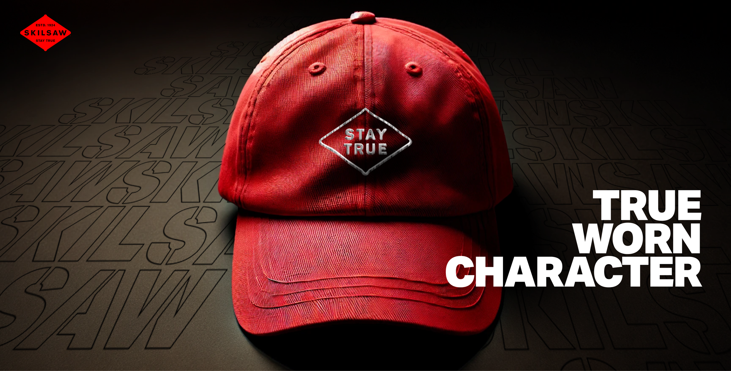
The award-winning brand identity, inspired by the worm drive punchout from SKILSAW circular saws, distinguished it from the DIY brand Skil and reinforced SKILSAW’s commitment to trade professionals. This reinvention included a comprehensive redesign of the user experience, from the website and packaging to apparel, ensuring every touchpoint engaged and catered to trade professionals effectively. Today, SKILSAW proudly stands as a symbol of true professional quality in the cutting tool industry.


We logged more than 300 hours with Trade Pros from sun-up to sun-down to understand their emotional and functional needs. We observed, co-created and validated through the entire process. We synthesized those needs with ownable attributes of the Skilsaw brand to create unique and ownable core messages that drove brand positioning, marketing messages, product design, packaging.
